QR code sign wording for weddings: ideas and a checklist
SnapPix TeamPublished 16 Aug 202641 min read
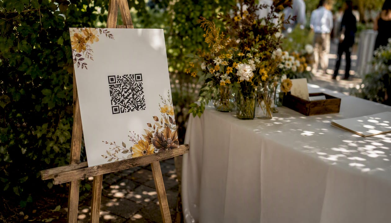
The most effective wedding QR sign combines a short, benefit-driven phrase with a clear destination hint, then gets tested on at least three phones before printing. Something like “Scan to add your photo to our wedding gallery” tells guests exactly what happens when they scan, and that clarity is what drives participation. A sign that just shows a code with no words around it will be ignored by a significant portion of your guests.
Here are three lines that work on small cards or tabletop easels right away:
Pro Tip: Print the destination URL in small text beneath the code as a backup. Guests with older phones or accessibility needs can type it directly, and you will not lose a single photo because of a scanning issue.
Clear, benefit-driven wording paired with a tested, well-placed QR code is what turns a decorative sign into a working photo-collection tool that guests actually use.
| Point | Details |
|---|---|
| Lead with the action | Start your sign wording with “Scan to…” and follow with the specific benefit (e.g. “add your photo to our gallery”). |
| Test on multiple devices | Scan with at least one iPhone and one Android before printing, and retest once signs are in position at the venue. |
| Place signs at pause points | Welcome table, guest book table, bar, and restrooms outperform high-traffic walkways for scan rates. |
| Include a printed URL | A backup URL beneath the code covers guests with older phones and meets accessibility best practice. |
| SnapPix for easy setup | One QR code, no app for guests, AI smart albums, and a three-month upload window make SnapPix a practical starting point. |
The wording on your sign does more work than the code itself. A QR code on its own can be confusing; even a few words of context materially increases scan clarity and uptake. The lines below are organised by tone so you can match the sign to your wedding’s personality, and by length so you can match the line to your physical sign size.
These suit couples with a relaxed, party-focused day. They work best on larger signs (A5 or bigger) where there is room for a second line.
These suit formal ceremonies and couples who want guests to feel part of something meaningful.
These are the highest-performing lines for participation because they remove all ambiguity. Short, benefit-driven CTAs consistently outperform generic “Scan me” phrasing in encouraging action.
Pro Tip: For table signs, lead with the action (“Scan”) and follow with the benefit (“to add your photo to our gallery”). That order mirrors how guests read: they see the code, they read the instruction, and they act.
These fit on a 2 × 3.5-inch card or a small tag tied to a favour. One line only.
These work on follow-up cards, thank-you notes, or a sign near the exit.
Location matters as much as wording. A sign in the wrong spot gets walked past; one at the right moment gets scanned immediately.
Government accessibility guidance recommends placing codes within reach for wheelchair users, which means positioning signs at an accessible height from the floor rather than at standing eye level. For pedestrian-facing locations where guests can safely pause, placement at low-speed or stoppable points is the consistent professional recommendation.
Pro Tip: Avoid placing signs where guests must stand in a walkway or block a service corridor to scan. A sign that creates a bottleneck will be moved by staff and may end up face-down on a table.
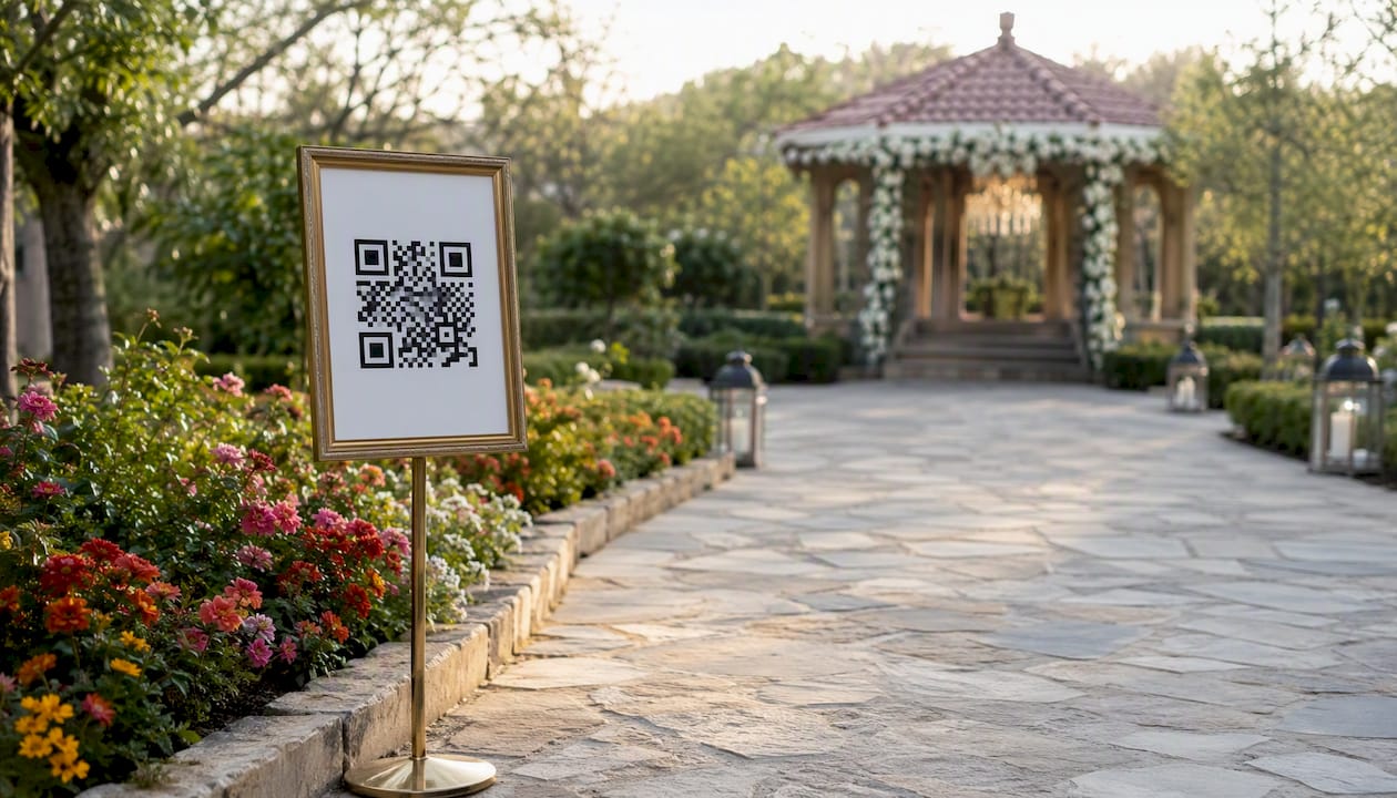
Generating a QR code and printing it is straightforward, but the testing step is where most couples skip ahead and regret it. Here is the full workflow.
Testing checklist:
Pro Tip: Ask a friend with a different phone model to test the code independently. What scans instantly on your phone may take three attempts on an older model with a slower camera.
A QR code that matches your wedding’s colour palette but fails to scan is worse than a plain black-and-white one. These rules keep the code beautiful and functional.
Accessibility checklist:
Pairing the code with explicit instruction makes the code and the CTA a single, readable unit — which is what the most successful signs do.
Do:
Don’t:
Quick fixes for common problems:
Run through this before you send anything to a printer.
Save this list to your planning folder and tick it off the week before the wedding, then do a final scan test on the day itself once signs are in position.
When a guest scans your wedding QR code, the experience should feel instant and frictionless. Here is what a well-built flow looks like from their perspective.
The guest opens their phone camera, points it at the code, and taps the notification that appears. A mobile-friendly page loads in their browser, no app download required. They can either take a photo directly in the browser or upload from their camera roll. After uploading, they see a confirmation and the photo joins the shared gallery. That is the whole interaction, and it should take under a minute.
SnapPix implements this flow with a single QR code for the whole event. Guests upload directly through the browser, the gallery stays open for three months after the wedding, and an AI organises uploads into smart albums automatically. There are no app installs, no logins for guests, and no manual sorting for the couple.
Labelling the destination on the sign (“Scan to add a photo to our wedding gallery”) removes the hesitation that stops guests from scanning. When guests know what they are scanning into, participation increases noticeably — and SnapPix’s photo challenges give guests an extra reason to keep uploading throughout the day.
Pro Tip: Add a brief privacy note to your sign or landing page: “Your photos are stored securely and shared only with the couple.” One line is enough to reassure guests who are cautious about uploading personal images.
Privacy is a reasonable concern when you are asking guests to upload photos to a shared platform. A few straightforward steps cover the main risks.
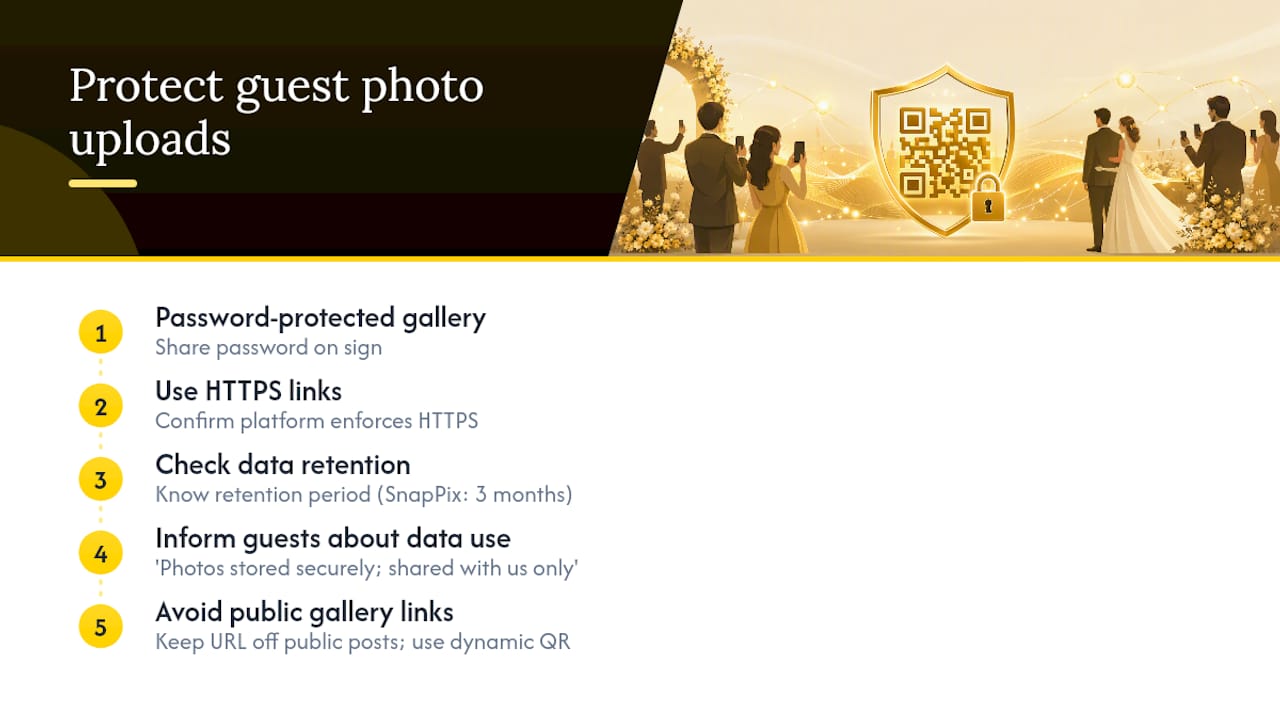
Choose a platform with password-protected galleries. A gallery that anyone with the link can view is fine for a small, trusted group, but a password adds a meaningful layer of control. Share the password on the sign or in the adjacent text so guests can access the gallery later without it being publicly searchable.
Use HTTPS links only. Any URL you embed in a QR code should begin with https://. An unencrypted link exposes upload data in transit. Most reputable photo-collection platforms handle this automatically, but confirm it before generating your code.
Check the platform’s data retention policy. Know how long uploaded photos are stored, who can access them, and whether the platform uses photos for any purpose beyond your event. SnapPix stores galleries for three months post-event with secure, password-protected access, which gives couples control over who sees the content and for how long.
Tell guests what you are collecting. A one-line note on the sign (“Photos are stored securely and shared only with us”) builds trust and increases willingness to upload. Guests who feel informed are more likely to participate.
Avoid public gallery links in printed materials. If your gallery URL is also the QR destination, keep it off public social media posts before the event. A dynamic QR code lets you change the destination if a link is shared more widely than intended.
The phrasing of your upload instruction is the single biggest lever you have on participation rates. Guests who understand the action and the benefit will scan; guests who are uncertain will not.
Lead with the action, not the technology. “Scan to share your photos” works better than “Use the QR code to access our photo-sharing platform.” The first tells a guest what to do in two seconds; the second requires them to parse a sentence.
State the benefit explicitly. “Your photos go straight into our wedding gallery” tells guests their contribution matters and has a destination. That specificity encourages people who might otherwise think “someone else will get a better shot.”
Keep the instruction to one or two lines on the sign itself. If you need more explanation, put it on a small card beside the sign rather than crowding the sign face. A cluttered sign gets skimmed and ignored.
Use inclusive language. “Share your photos” includes guests who took one photo and guests who took two hundred. “Upload your best shot” can feel exclusionary to guests who are not confident photographers. The more open the invitation, the more uploads you will receive.
For table signs, a two-line format works well:
Line 1: “Scan to add your photos to our wedding gallery” Line 2: “No app needed — it takes less than a minute”
The second line removes the two most common objections (needing to download something, and it taking too long) before guests even raise them.
A QR code without a call-to-action phrase is a decorative square. The most successful signs treat the code and the CTA as a single, readable unit, and the CTA does the persuasion work the code cannot do on its own.
The phrase needs to do three things: tell guests what to do (scan), tell them what happens (photos go to the gallery), and remove friction (no app, takes a minute). You do not need all three in every context, but the more of them you include, the higher your participation will be.
For a large welcome-table sign, you have space for all three:
“Scan to add your photos to our wedding gallery, no app needed, takes under a minute.”
For a small favour tag, you have space for one:
“Scan to share a photo.”
The key is that the phrase must appear adjacent to the code, not on a separate card or in a different part of the room. Placing the instruction next to the code is what makes the sign a single, scannable unit rather than two separate elements guests have to connect mentally.
Avoid generic phrases like “Scan me” or “QR code.” They tell guests nothing about what they are scanning into, and they perform noticeably worse than benefit-driven alternatives.
The couples who get the most guest photos are not the ones with the most signs. They are the ones whose signs are clearest. Every time I see a QR sign that just says “Scan me” with no destination label, I know the couple will end up with a fraction of the photos they could have had.
My priority order is always: clarity first, then benefit, then brevity. Get the instruction right before you worry about whether the wording is funny or sentimental. A guest who understands what they are scanning into will act; a guest who is charmed but confused will not.
On the day itself, do one final scan test after the signs are in position. Venue lighting changes everything. A code that scanned perfectly in your kitchen may reflect off a candle-lit table in a way that makes it unreadable. That five-minute check on the morning of the wedding has saved more than a few galleries.
Choose wording that makes the guest action obvious and low-friction. If a guest has to think for more than two seconds about what to do, the moment is gone.
Sorting out a photo-collection workflow from scratch takes time you probably do not have in the final weeks before your wedding. SnapPix gives you a single QR code that covers the whole event, with no app required for guests and no manual gallery sorting for you.
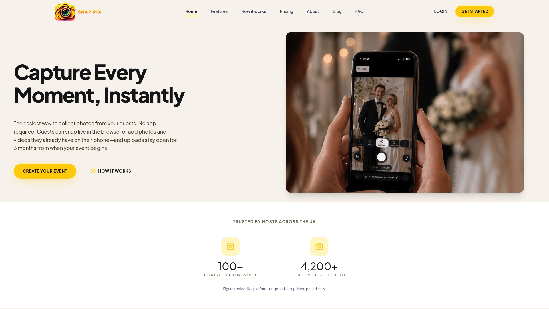
Guests scan, upload from their camera roll or take a photo directly in the browser, and the AI organises everything into smart albums automatically. The gallery stays open for three months, so guests who upload the morning after are included too. Secure, password-protected galleries mean only the people you choose can view the photos, and high-resolution downloads are available whenever you are ready.
See how SnapPix works and set up your wedding gallery in minutes.
A short list of reliable resources for generators, design guidance, and accessibility standards.

Event hosts' practical guide to posed and candid photos: perception research, hands on shooting tips, and no app guest uploads to boost candid coverage.

Which event technologies are production ready for 2026 and how to adopt them with clear consent, governance, and a no app QR photo pilot.

Which routes keep EXIF or strip GPS? Quick checks to view or remove metadata, plus a three month workflow to collect guest photos.